

Bit.ly recently thrust a new design upon the world to the loud and thunderous applause of just about no-one. Rather than run in horror, I thought it would be instructive to point out a few of the more apparent flaws in their design. As they say, in life you’re either an example to follow or a warning to be avoided. I think the new Bit.ly redesign falls into the latter camp.
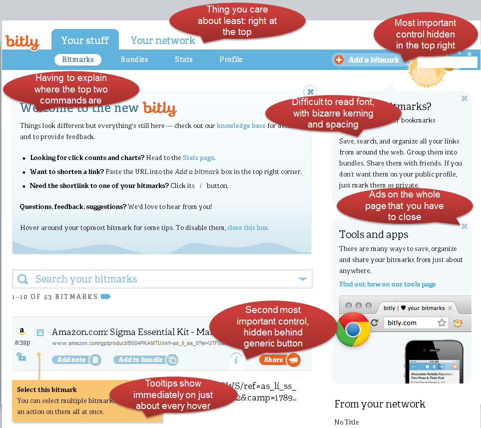
UX Sins 1&2: Hide the most important commands
Admittedly I’m not a power user of bit.ly, but I would think that for any shortlinks service creating the shortlink and accessing the shortlink would be among the most used tasks. So I find bit.ly’s choice of where to place these commands at best curious. Adding a shortlink is located all the way to the top right. Eye tracking study after eye tracking study has shown that – for users in left to right languages – the top right is mostly ignored. A few commands can get away with it because of general design precedent across the industry – search and login being two such examples. In general though, the top right should be avoided.
Even more troubling, access to the shortlink is hidden behind a curious i icon. At first I thought erroneously, “This control must be here somewhere and really easy to find.” So I looked in vain before eventually reading the help. Yikes. It’s another click away.
UX Sin 3: Promote the least important control
Again I’ll admit to not being a power user – but ‘Your network’ is right in the hot zone of controls I look at first, and is completely useless to me. Why would I ever go there? Why is it so prominent?
The navigation between Bitmarks, Bundles and Stats seems reasonable, but they’ve made an odd choice promoting ‘Profile’ to the same level. I only use that once in a blue moon, right? There’s a reason the entire rest of the Internet world puts profile controls in the top right.
UX Sin 4: Help is needed to use the app
If you find yourself wishing that users had more training, or that help were easier to find then you have failed to create a usable design. Devoting a large portion of your first page to help should be like a flashing siren that something is wrong.
Unfortunately, in this case help is actually necessary because of UX sins 1 and 2.
UX Sin 5: Tooltips everywhere, all at once
As you hover over elements on the page tooltips flash on and off, helpfully informing you of anything from the obvious ‘you can select multiple bookmarks’ to the esoteric ‘click here for the short link’. I’m not against tooltips in general, but their use should be judicious. They should clarify only the most confusing concepts. The best designs will make those concepts self evident.
UX Sin 6: The whole page is full of ads
From the huge help banner at the top, to the ads down the right hand side. The actual content of the experience is squashed into the middle, barely appearing before the scroll bar on my 24″ inch monitor. As a guide, if most of the elements of your page has close buttons, you’re doing it wrong. The one exception is a customizable dashboard, but the UI below doesn’t qualify as a dashboard.
UX Sin 7: Unreadable text
Typography is something you never notice unless it is beautiful, like Microsoft’s Metro, or awful like our example today. The weight, kerning and spacing of the text is sloppy, and makes it difficult to read.
This is actually quite difficult to get wrong in HTML because generally your standard Verdana or Arial work just fine.
It’s easier to criticize
Bit.ly’s new design does a lot wrong – if I had the time and a few more thousand words I could dissect each nuance of the design, but I think by now you get the point. Yet it is easier for me to sit in judgement than create the design. I look at the finished product and see everything that is wrong with it. I didn’t create it. I didn’t balance the conflicting design, business and engineering goals to produce what you see below.
The hard thing about a design is not only making it beautiful and functional, but bringing it to market. The most perfect design is useless if it never sees the light of day.
I hope that the bit.ly team can learn from some of their mistakes, and improve in the next release. I do love their service, just not the redesign.

Vanessa, you’ve done a great job deconstructing bit.ly’s redesign. Here is my own experience: It was nice to see that on the un-logged-in homepage, the entry box to paste a link into was visually obvious and simple — though I… Read more »
Thanks Richard,
You make lots of good points – I really think they missed the mark on this one.